Chart functions
This page documents the chart functions available on the Model validation page. Each chart looks at the model–measurement comparison from a different angle — point‑to‑point agreement, distributions, time evolution, cycles, multi‑metric summaries and spatial structure — because no single index or plot is enough to judge an air‑quality model. For every function we describe what it shows, how it is built (and from which data) and the reasons that led us to add it.
🕒 = the function downloads raw data from the server (windowed loading with a progress bar); the others use the summary data already pre‑computed in the validation data / the percentiles and are therefore instant. 🕒🕒 = heavy, non-optimizable processing: the wait can reach a few minutes. Every cartesian chart has a toolbar to export to CSV and image (SVG/PNG), and to zoom and reset.
Agreement and model skill
Charts that directly compare model and observations to quantify correlation, bias (systematic error) and scatter (random error).
Scatter plot model vs observed 🕒 server data
What it shows. The cloud of hourly pairs (observed on X, modelled on Y). With many thousands of points the cloud is rendered as a density heatmap on a 60×60 grid; the 1:1 line (perfect agreement) and the regression line are overlaid.
How it is built. Pairs are fetched via scatter_data (time intersection between station measurements and the model value in the matching cell, filterable by year/season/month). Slope, intercept and R come from the validation data («global» record).
Why we use it. It is the fundamental point‑to‑point comparison: it shows scatter, any systematic bias (departure from 1:1) and non‑linearities in the model response.

Conditional bias by concentration 🕒 server data
What it shows. The mean model value for each observed‑concentration class, with a spread band (IQR P25–P75 or P10–P90), compared with the 1:1 line.
How it is built. The obs/mod pairs (scatter_data) are grouped into classes by observed concentration (quantile, i.e. equal count, or equal width); per class we compute mean observed (abscissa), model mean/median and percentiles.
Why we use it. The global scatter hides where the model fails: this chart isolates the bias as a function of level, exposing the typical underestimation of peaks — crucial for exceedances and health effects.

Q-Q plot
What it shows. Observed quantiles against modelled quantiles (P10…P99) for each pollutant, with the 1:1 line.
How it is built. From the pre‑computed percentiles («global»), measured and model sources.
Why we use it. It compares the distributions independently of time pairing; it is especially sensitive to disagreements in the tails (extreme values).

Taylor diagram
What it shows. In a single point per station×pollutant: correlation (angle), the ratio of standard deviations σ_mod/σ_obs (radius) and the normalized RMSE (arcs centred on the «observations» point).
How it is built. From the validation data (global): r, std_obs, std_mod; normalized RMSE is √(1 + σ² − 2σR), with σ = σ_mod/σ_obs.
Why we use it. A single figure summarises phase error (R) and amplitude error (σ): it is the standard for comparing many series at once.

Animated Taylor diagram (month) 🎞️ animation
What it shows. The same Taylor diagram, animated over time: each frame is a month (1–12) and each station is a point moving month by month. The timeline at the bottom provides autoplay, pause and manual month selection; a selector adjusts the speed and the legend toggles individual stations on/off.
How it is built. From the validation data with the "month" stratification (r, std_obs, std_mod for each month): the diagram background (standard-deviation arcs, RMSE arcs, correlation rays) is fixed, while the points are updated frame by frame. The radial scale is computed over all months, so the diagram does not "jump" during the animation.
Why we use it. The static Taylor averages the whole period: the animation reveals the seasonal evolution of the performance — months where the model loses correlation or amplifies/dampens variability — and makes station comparisons through the year immediate.

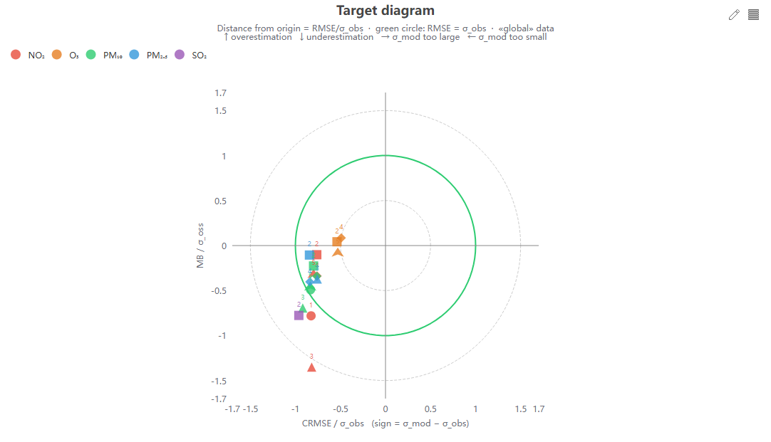
Target diagram
What it shows. Normalized bias (Y) against signed normalized centred error (X); the distance from the origin is RMSE/σ_obs, and the green circle (radius 1) marks an error equal to the observed variability.
How it is built. Jolliff variant: from mb, crmse, std_obs, std_mod — X = sign(σ_mod − σ_obs)·CRMSE/σ_obs, Y = MB/σ_obs (since RMSE² = MB² + CRMSE²). Normalized on σ_obs because we do not have the measurement uncertainty required by the FAIRMODE MQI.
Why we use it. It classifies at a glance both quality (closeness to the origin) and the type of error: the quadrant indicates over/underestimation and excessive/insufficient variability.
Performance diagram
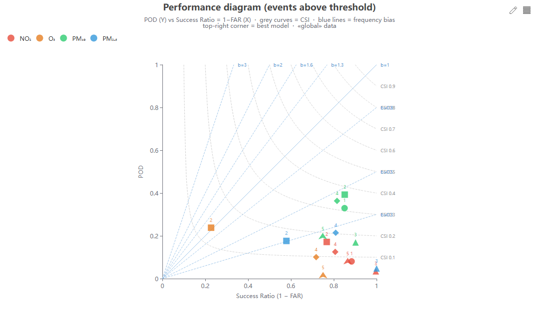
What it shows. For events above threshold: POD (probability of detection) against Success Ratio (1−FAR), with CSI curves and frequency‑bias lines in the background. The top‑right corner is the perfect model.
How it is built. From pod/far in the validation data (the event threshold is predefined). CSI curves and bias lines are drawn analytically.
Why we use it. Continuous metrics do not capture the ability to forecast exceedances: here missed alarms and false alarms are balanced, a central concern for public health.
Scatter σ-ratio vs R
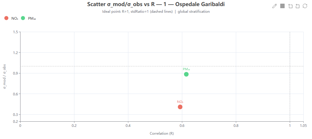
What it shows. For one station, each pollutant as a point at (R, σ_mod/σ_obs), with the ideal lines R = 1 and stdRatio = 1.
How it is built. From the validation data (global).
Why we use it. It visually separates the phase error (low R) from the amplitude error (stdRatio ≠ 1), guiding the diagnosis of causes.
Taylor diagram 3D — season (Z axis)
What it shows. The Taylor diagram extended to a third dimension: each level on the Z axis is a season, so you can see how agreement changes over the year.
How it is built. Same ingredients as the Taylor diagram (r, σ_mod, σ_obs) extracted for the «season» stratification; reference arcs replicated for each level (ECharts GL).
Why we use it. It pinpoints the seasons in which the model degrades (e.g. winter inversions, summer photochemistry).

Taylor diagram 3D — pollutant (Z axis)
What it shows. As above, but the Z axis scrolls through the pollutants: it compares model skill across species in a single space.
How it is built. From the validation data (global), one Taylor plane per pollutant.
Why we use it. It lines up the model's strengths and weaknesses for each pollutant.

Taylor diagram 3D — hour of day (Z axis)
What it shows. The Taylor diagram with hour of day on the Z axis: how agreement varies over the 24 hours.
How it is built. From the validation data («hour» stratification).
Why we use it. It reveals the critical time windows (traffic rush hours, afternoon photochemical peak).

Time evolution
Charts that follow measurements and model over time, from single episodes to recurring cycles.
Time series model vs observed 🕒 server data
What it shows. The two series (measured and model) overlaid over time, with selectable aggregation (daily, 7‑ or 30‑day moving average, monthly) and an optional residual band (model − observed).
How it is built. From daily obs/mod means (calendar_data); aggregation and residuals are computed client‑side on the cached days. Global R, MB and RMSE are shown in the subtitle.
Why we use it. It is the most direct diagnostic and filled an obvious gap: it makes episodes, seasonal drift and anomalous periods visible where aggregate metrics hide them.

Diurnal cycle
What it shows. The mean daily cycle (hourly median P50) of measured (solid line) and model (dashed), for each pollutant present.
How it is built. From the percentiles («hour» stratification).
Why we use it. It checks the reproduction of the daily cycle (traffic, photochemistry) and highlights any hourly phase shifts.

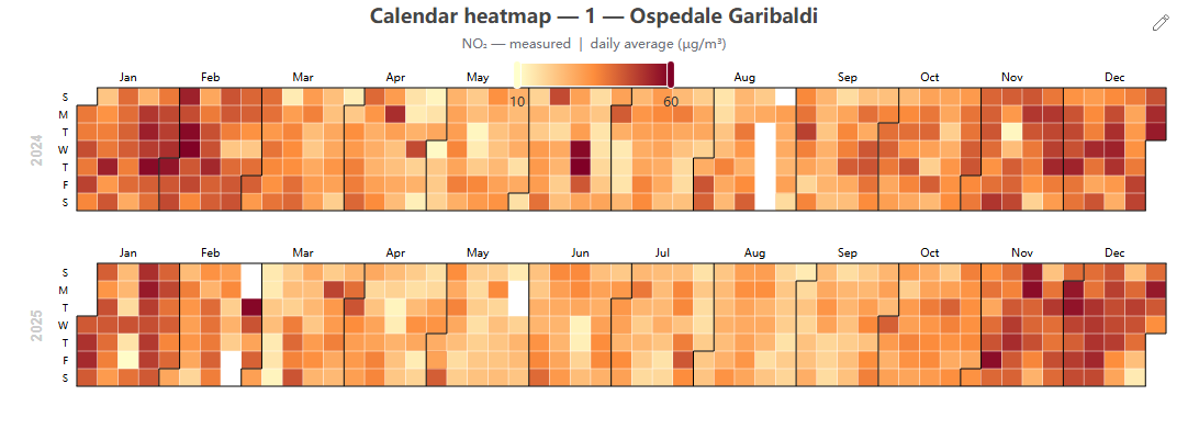
Calendar heatmap 🕒 server data
What it shows. A yearly calendar where each day is coloured by the daily mean (measured, model or bias model − measured).
How it is built. From calendar_data (daily obs/mod means).
Why we use it. It gives an overview of seasonality, acute episodes and data gaps, hard to grasp in a continuous series.
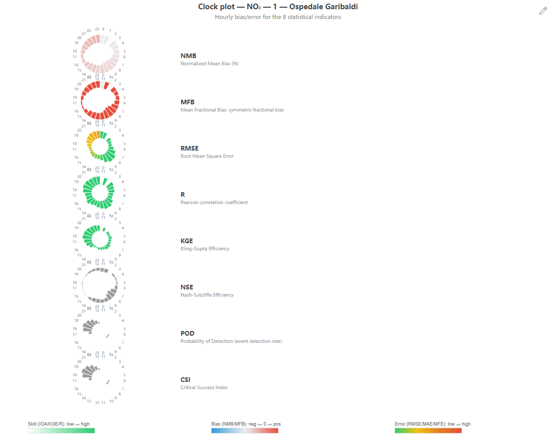
Daily bias clock plot
What it shows. A chosen indicator arranged on a 24‑hour dial (the hours in a circle), to read how the metric varies through the day.
How it is built. From the validation data («hour» stratification), with a diverging scale for bias metrics.
Why we use it. It compactly and intuitively highlights the hours of the day where the metric (e.g. bias) concentrates.
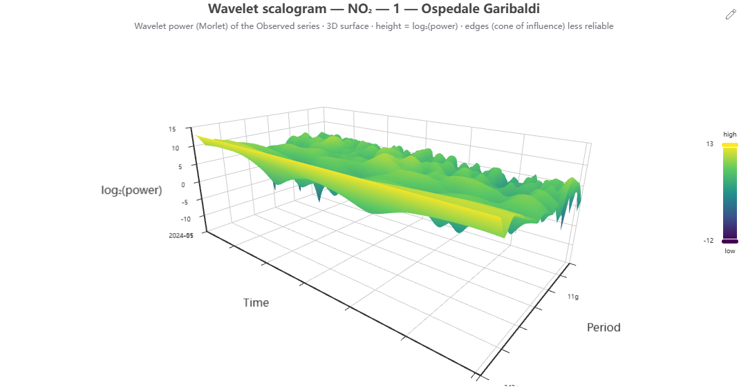
Wavelet scalogram 🕒 server data
What it shows. The wavelet (Morlet) power of the chosen series (observed or model) in the time×period plane: where and when a periodicity (diurnal, weekly, monthly…) is strongest. The area outside the cone of influence is not shown.
How it is built. The daily or hourly series (resolution selector) is fetched via calendar_data/series_hourly; the continuous Morlet wavelet transform is computed client-side (FFT), with power |W|² on a logarithmic scale (log₂). Columns are subsampled for rendering.
Why we use it. Unlike an average cycle, it localises in time the intensity of periodicities and reveals their non-stationarity (e.g. a stronger diurnal cycle in summer, episodes).
2D/3D view. A selector switches from the 2D heatmap to an interactive 3D surface (height = log₂ of the power), which makes the ridges of the dominant periodicities and their evolution over time stand out. In the 3D view the surface also includes the cone of influence (edges less reliable) and time is subsampled more finely to stay smooth.

Wavelet coherence observed↔model 🕒 server data
What it shows. The squared wavelet coherence R² (time, period), between 0 and 1, of observed vs model: at which time scales and in which periods the model reproduces the cyclic structure of the observations.
How it is built. Wavelet transforms of observed and model on the same daily grid, with the cross-spectrum smoothed in time and scale (Torrence & Webster 1999); the area outside the cone of influence is not shown.
Why we use it. A validation diagnostic beyond global correlation: it indicates whether the model captures the diurnal/weekly cycle and where it loses coherence.

STL decomposition (trend / seasonal / residual)
What it shows. The STL decomposition of the daily series in four aligned panels (series, trend, seasonal, residual), with observed and model overlaid and toggleable from the legend; the time zoom is synchronised across panels.
How it is built. It reads the pre-computed STL (statsmodels, weekly period) via the stl_data endpoint.
Why we use it. It separates the underlying trend, the cycle (seasonal) and the anomalies (residual, e.g. Etna episodes), and directly compares the three components of observed and model.

Hour × season cycles
Heatmaps and clock plots crossing hour of day with month or season, to read combined periodic patterns.
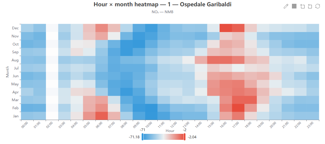
Heatmap hour × month (flat)
What it shows. A 24‑hour × 12‑month grid coloured by the chosen metric (or by the raw median concentration).
How it is built. From the validation data or percentiles («hour_month» stratification).
Why we use it. It reveals combined hour–season patterns, such as summer afternoon ozone peaks.
Heatmap hour × month (cylinder)
What it shows. The same information wrapped onto a 3D cylinder: the angle is the hour, the height the month.
How it is built. The same data as the flat version, projected onto a cylindrical surface (ECharts GL).
Why we use it. The cylindrical shape removes the artificial discontinuity between hour 23 and hour 0, restoring the true daily periodicity.

Heatmap season × hour (flat)
What it shows. A season × hour grid coloured by the chosen metric or raw concentration.
How it is built. From the validation data / percentiles («season_hour» stratification).
Why we use it. It directly compares the diurnal cycle across the four seasons.

Heatmap season × hour (cylinder)
What it shows. The 3D cylindrical version of the season × hour heatmap.
How it is built. The same «season_hour» data on a cylindrical surface (ECharts GL).
Why we use it. A continuous reading of the hourly cycle, with no 23→0 jump, for each season.

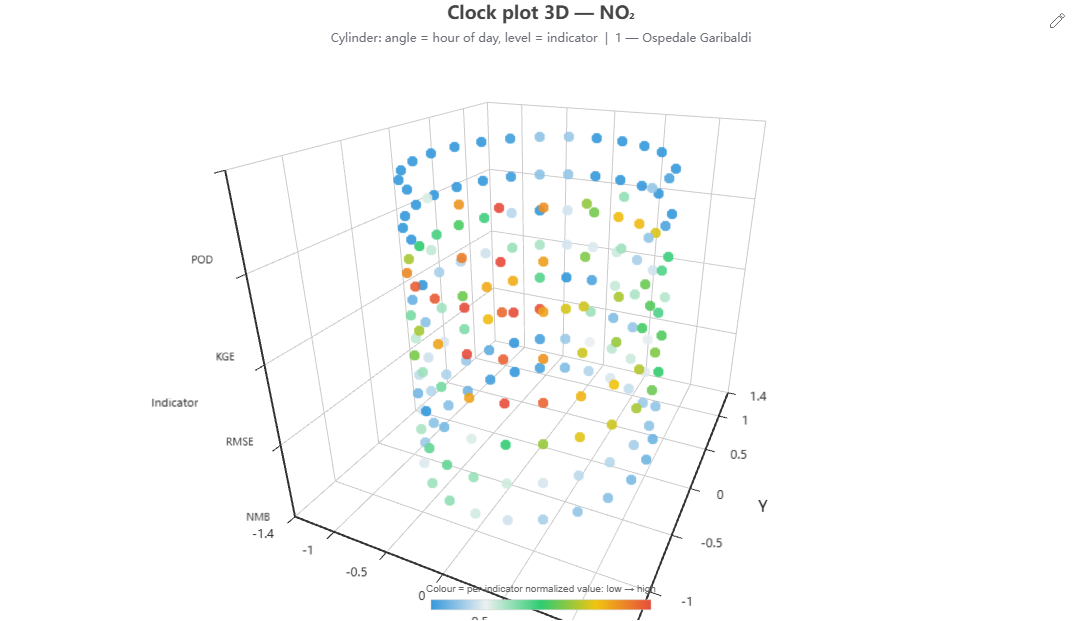
Clock plot 3D (cylinder)
What it shows. A cylinder where the angle is the hour of day and the levels on the Z axis are the various indicators, with colour‑coded normalized values.
How it is built. From the validation data («hour» stratification); each indicator is normalized over its own range. Averaging across all stations is possible.
Why we use it. It compares several indicators along the hourly cycle in a single figure.
Distributions
Charts that compare the shape of the measurement and model distributions, beyond the means alone.
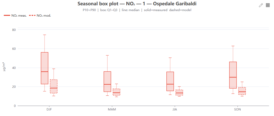
Seasonal box plot per pollutant
What it shows. Seasonal box plots (P10 – Q1 – median – Q3 – P90) for a single pollutant, with measured and model side by side; a selector changes pollutant.
How it is built. From the percentiles («season» stratification).
Why we use it. It compares the seasonal spread, not just the central values, showing whether the model compresses or widens the distribution.
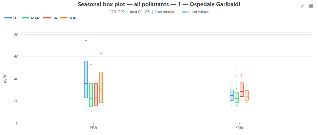
Seasonal box plot, all pollutants
What it shows. Seasonal box plots of all pollutants together, with a measured/model switch.
How it is built. From the percentiles («season» stratification).
Why we use it. A comparative overview of variability across species.
Peak percentile comparison (P90/P95/P99)
What it shows. Grouped bars of the high percentiles (P90, P95, P99) observed and modelled for each pollutant.
How it is built. From the percentiles («global» stratification).
Why we use it. High percentiles govern regulatory exceedances: here we check whether the model reproduces the peak levels.

Monthly percentile band (P50 + P10–P90)
What it shows. For each month of the year (Jan–Dec) the median (P50) of observed and model, with the P10–P90 band of the observations: typical level and monthly spread compared.
How it is built. From the monthly percentiles (stratification «month», sources «measured» and «model»).
Why we use it. It shows the monthly climatology and checks whether the model captures the median level and the spread of variability through the year.

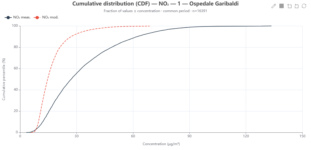
Cumulative distribution curves (CDF) 🕒 server data
What it shows. The empirical cumulative curves (ECDF) of observed and model over the common period: for each concentration, the fraction of values less than or equal to it.
How it is built. From the scatter_data pairs; values are sorted and sub‑sampled for lightness.
Why we use it. A full distributional comparison (not just seven percentiles), complementary to the Q-Q plot and box plots.
Multi-metric summary
Charts that condense several indices into a single overview.
Seasonal radar chart
What it shows. One radar per station with the four vertices = seasons, plotting the value of a chosen metric; pollutants are overlaid series.
How it is built. From the validation data («season» stratification).
Why we use it. It compares the metric across seasons, pollutants and stations at a glance.

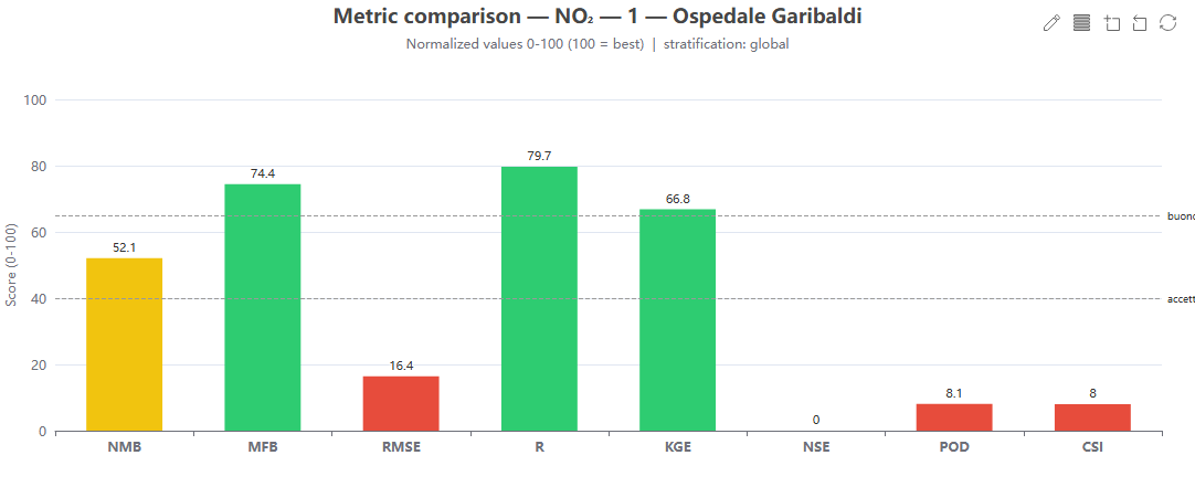
Multi-metric comparative bar chart
What it shows. Bars of all metrics, normalized 0–100 (100 = best) for a pollutant/station, coloured by quality band.
How it is built. From the raw validation values normalized with the same rules as the score; it respects the selected stratification (global/season/hour).
Why we use it. A compact dashboard of the model's strengths and weaknesses on a single comparable scale.
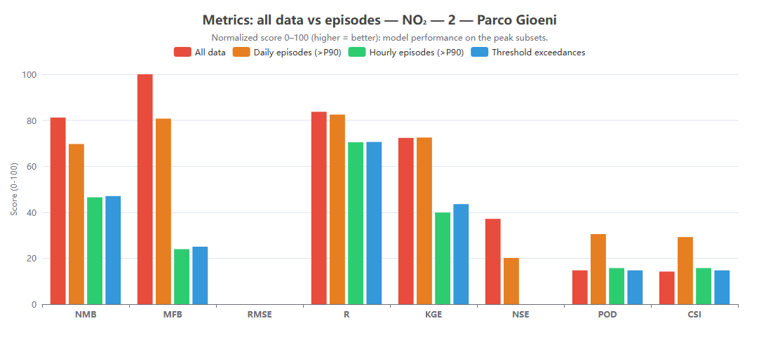
Metric comparison: all data vs episodes
What it shows. For each metric (normalized score 0–100), grouped bars comparing the model performance on all data with that on peak episodes only: days whose observed daily mean exceeds the P90, hours whose observed value exceeds the hourly P90, and exceedances of the regulatory threshold (when defined for the pollutant).
How it is built. From the "episodes" stratification of the validation data: the metrics are recomputed restricting the sample to the peak subsets of the observations (strata day_p90, hour_p90, exceed) and normalized with the same rules as the score.
Why we use it. Whole-period averages can hide the model behaviour exactly when it matters most: acute episodes, relevant for health and for regulatory limits (PM in particular). The comparison reveals how much quality degrades moving from ordinary conditions to peaks.
O₃ exposure indices (SOMO35 / AOT40) 🕒 data from server
What it shows. For each year, the regulatory ozone-exposure indices computed from the model and from the measurements: SOMO35 (sum of the excesses of the daily maximum 8h running mean above 70 µg/m³ — health) and AOT40 (sum of hourly excesses above 80 µg/m³ during 8–19h, May–July — vegetation), on two separate axes.
How it is built. Direct SQL computation from the hourly series: for SOMO35 the 8h running mean uses a time window robust to missing hours (at least 6 of 8 values); for AOT40 the months and hours prescribed by the definition are filtered. Observed from the station measurements, model from the corresponding grid cell.
Why we use it. These are the indicators the legislation (Dir. 2008/50/EC) uses to assess ozone: comparing them model-vs-measurements tells whether the model is reliable for regulatory purposes, not just statistically. Cumulative indices amplify systematic biases on the upper tails.

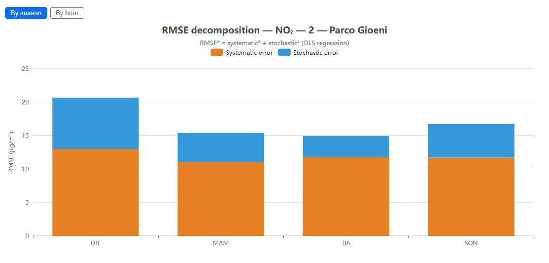
Error decomposition (systematic / stochastic)
What it shows. The RMSE split into two stacked components: the systematic part (explained by the model-observation linear regression, i.e. reducible with a calibration) and the stochastic part (residual scatter, not linearly reducible). Viewable by season or by hour of day.
How it is built. Willmott's decomposition from the OLS regression mod = a + b·obs: RMSE_s² = ⟨(a+(b−1)·obs)²⟩ and RMSE_u² = RMSE² − RMSE_s². Entirely derived from the metrics already computed (rmse, slope, intercept, σ_obs, mb, nmb), without reprocessing the series.
Why we use it. It tells what kind of error dominates: if the systematic part prevails, the model can be improved with bias correction or tuning; if the stochastic part prevails, the limit lies in the model physics/resolution. The season/hour view localizes where to intervene.
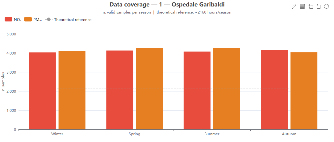
Data coverage (n samples) by season
What it shows. Bars of the number of valid samples per season and pollutant, with a theoretical reference line (~2160 hours/season).
How it is built. From the n_samples field of the validation data («season» stratification).
Why we use it. Data coverage conditions the reliability of all metrics: few valid hours make the indices fragile.
Spatial and multivariate
Charts that add the spatial dimension or relate several variables at once.
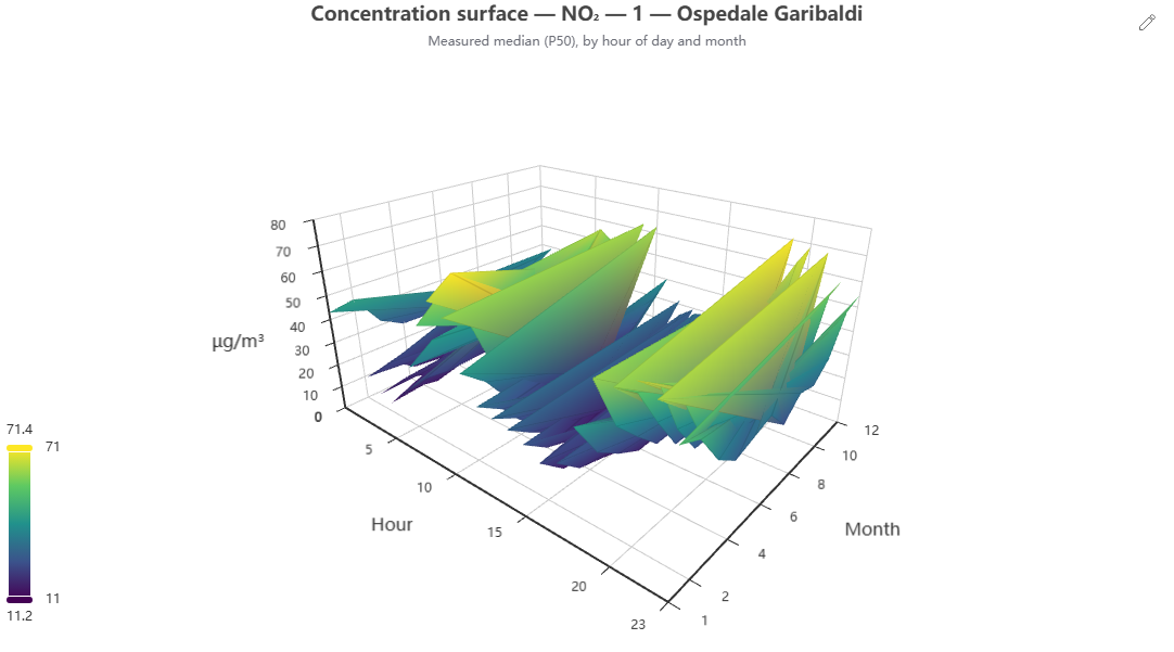
Concentration surface plot
What it shows. A 3D surface of the measured median concentration as a function of hour of day and month.
How it is built. From the percentiles («hour_month», measured P50), rendered with ECharts GL.
Why we use it. A three‑dimensional overview of the cyclic behaviour, useful to spot seasonal crests and troughs.
3D multivariate scatter 🕒 server data
What it shows. A 3D cloud of three pollutants at once (one axis each), to explore multivariate relationships — for example the Leighton titration among NO₂, O₃ and PM₂.₅.
How it is built. From scatter3d_data (time‑aligned values for the three species).
Why we use it. Some chemical relationships emerge only when looking at three variables together, not pairwise.

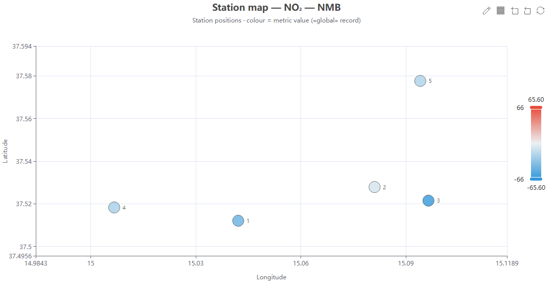
Per-station map (metric)
What it shows. The stations positioned by longitude/latitude and coloured by the chosen metric (diverging scale for biases).
How it is built. From the validation data («global» record) and the station coordinates; without a base tile, it highlights the relative spatial pattern.
Why we use it. It reveals spatial structures of the error (e.g. systematic underestimation in urban areas) not visible in tables.
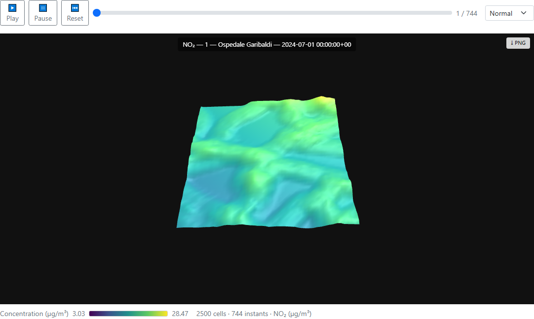
3D concentration grid animation 🕒🕒 long wait
What it shows. A 3D animation of the model concentration field over a grid around the station, with a time player.
How it is built. From grid_animation_data (cells and frames loaded in windows), rendered with ECharts GL.
Why we use it. It shows the spatio‑temporal evolution of an episode or plume, impossible to render with a point series.
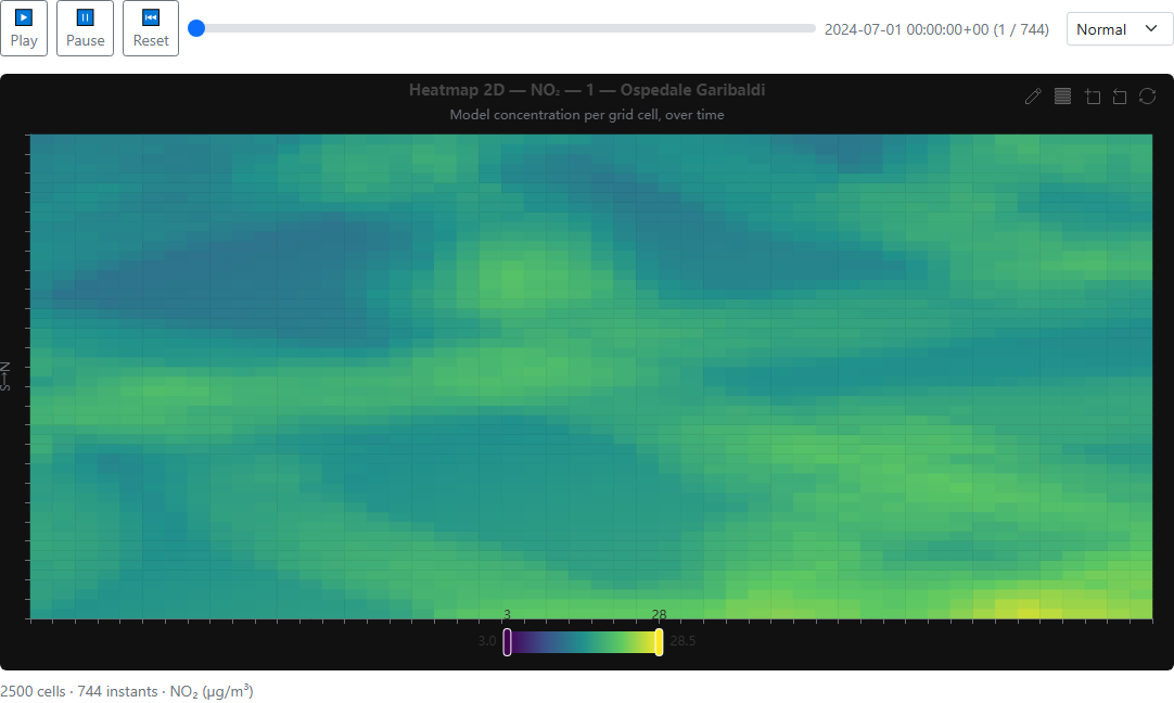
2D time-lapse heatmap on map 🕒🕒 long wait
What it shows. The same model field as a 2D grid heatmap, animated over time with a player.
How it is built. From grid_animation_data; cells are indexed by longitude and latitude.
Why we use it. A planar, immediate reading of the time evolution, complementary to the 3D rendering.